

UX Design for 3D Interactive Learning Application
Year: Fall 2020
Role: UX Design/Research.
Co-op term project
Client: UBC Biochemistry and Molecular Biology Department
Target Users 2nd year Biology students, biology lecturers
Term goal: Iterate on the initial feature design based on the user goals to support future development.
During my co-op term at UBC's Emerging Media Lab, I was project lead and UX Designer/Researcher for the MVP project: 3D Metabolism.
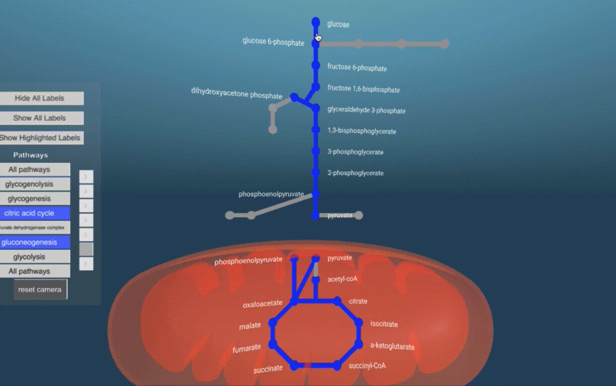
Metabolism refers to a complex network of chemical reactions that occur within living organisms. In undergraduate Biology classes, individual processes within this network are often taught separately, leaving students struggling to understand how the metabolic pathways interconnect in the big picture.
The 3D Metabolism project is a 3D interactive network designed to help Biology students visualize how metabolic processes interconnect in an overall network. By offering opportunities for students to drill down into the network, this tool aims to make complex content manageable and accessible.
Project Goals
Help students integrate individual processes into the overall network
Help students visualize flux (movement) across metabolic pathways
Help students manage
visual complexity
Key Deliverables
01.
User Journey
Map
02.
Low-fidelity
User Testing
03.
User Flow
Design
04.
UI Design / Prototype
User Research
User Journey Map
Before I joined the project team, a student consultation was conducted to empathize with the needs of the primary user group: second-year Biology students.
The user research was available as a collection of notes, but to help visualize the current user process I created a user journey map to illustrate the students needs when learning about the metabolic network.

User Journey Map: I organized the research findings in this structure to illustrate how a student currently learns about the metabolic network.
Synthesizing the research confirmed that our most important goals were to:
-
Facilitate problem solving questions (big picture + details)
-
Help students visualize "flux" (movement within a pathway)
-
Help students manage complexity
Design Exploration
Early UI sketching & wireframes
Prior to joining the project team, our UI Designer Kim Nipp designed an initial iteration of the interface. During this term, we collaboratively worked together to:
-
Define the information architecture and user flow
-
Integrate the new features into the design
-
Translate the 2D interface design for a 3D experience
We worked closely together on the interface design throughout the project; co-designing various features during remote sketching sessions, collaborative Figma files, and hand-drawn sketches. I often focused on creating simple wireframes and building comprehensive flows while Kim created 3D assets and high quality visual comps, though our roles overlapped throughout the project.


Early UI iterations: I worked closely with our UI designer to collaboratively develop the UI design.
Low-fidelity prototype and user testing
Our development team implemented a low-fidelity prototype in A-frame to test our assumptions about the product features early in the process. This gave us a chance to identify which features were valuable, what was missing, and if there were any usability barriers in the current design.
I took ownership of the entire user testing process; from developing the protocol, organizing the sessions, moderating the tests and interviews, and synthesizing the outcomes into prioritized action items.

Screenshots of prototype: Our developers implemented simple examples of the features and I used this prototype to conduct a remote user test with 12 Biology students.
Usability Testing
User Test Outcomes
Critical
-
Metabolite reactions need to exist within pathways, as current location is inaccurate
-
Camera needs accessible "Reset" option
Recommended
-
Students need to be able to track reactions along a pathway
-
Students need more context about individual pathways and metabolites
Suggested
-
Pathway UI menu needs to better communicate functionality
-
Students need an intermediate view between overall network and reaction details
Updated User Flow

I created this user flow to illustrate the updated sitemap before we began designing the details of the updated pages. This flow aims to provide an overview of the structure of the network while indicating how a user would access specific details, such as a Reaction Card.
Final UI Design


After many iterations and sketching exercises with the team, Kim and I collaborated on the final UI mock-ups in Figma.
Our solutions addressed the key features of the tool: highlighting pathways, "zooming" into details, and playing flux animations.
UI Solution: Simplify the Pathway Highlight


Updated UI Design: Includes visual comps for feature update.
The updated design allows the user to access the “multi-pathway select” under the “More Options” drop-down menu. This feature is primarly for lecturers presenting the content and therefore didn’t need to be active as a default interaction.
We also added a hover interaction to help signify the function of the pathway checkboxes and highlight overlapping pathways.
Why did we change this feature?
-
Support needs of students (identify pathways) and lecturers (present multiple pathways).
-
Restrict highlight styles, as a single node could belong to 20+ pathways.
-
Manage visual complexity.
Original feature: This design required the user to click a pathway button multiple times to change highlight style. Users found this design confusing.

UI Solution: Add individual pages for pathways

Updated UI Design: Includes visual comps for feature update.
We created specific pages for each pathway that houses the pathway-specific information, based on the outcomes of the user test.
Applying progressive disclosure to the content helps manage information complexity, while keeping the overall network visual at a low opacity in the background reinforces the pathways location within the network.
Why did we add these pages?
-
Reactions and sequences needed to be contained in pathways.
-
Students needed a view between the overall network and reaction details.
-
Students needed more information about pathways.
Original feature: Early iteration did not include a pathway page, only a network view or single reaction view.

UI Solution: Info cards to replace camera zoom


Updated UI Design: Includes visual comps for feature update.
After testing the first iteration of the reaction “zoom” feature, we found that students became disoriented once the camera zoomed into the reaction.
We updated this feature to include pop-up cards with the metabolite models and reaction content. This allows the user to navigate through the detailed reactions without losing track of the overall process while keeping the network model simple.
Why did we change this design?
-
Students needed the metabolite structure to be more accessible.
-
Students expected more information to appear when interacting with a node.
-
Students were disoriented by the camera zoom.
Original feature: camera "zoomed" into the space between two nodes to reveal the reaction.
UI Solution: Applying the template to complex content

As this project continues to develop, our content structure will need to adapt to different types of content.
Here is an example of how I adapted elements from our original design to guide the user into a more cinematic pathway example. The shapes within the inset zoom utilize the same pop-up cards previously used to describe reactions, and selecting the inset guides the user into a detailed tour of the content.
The 3D models shown here were created by our UI designer, and I created this visual comp with interaction animations using Figma.
Project Outcomes
The 3D Metabolism project is an ongoing acedemic project being developed through the Emerging Media Lab at UBC.
While this tool will continue undergoing iterations in the future, the Principal Investigators were very enthusiastic about the design progression and problem solving during this term.
The outcomes from the user test conducted this term will also continue to inform design choices and set the standard for a user-focused design process as the project develops.
Learnings
Don't assume the needs of the end user. We discovered during user testing that our users needed a separate page that contained all the information about a single pathway, despite our assumptions that this was already covered in textbooks.
User testing can help convince stakeholders. We were able to convince our clients of the importance for single pathway pages after getting feedback from the end users.
Collaboration leads to stronger ideas and teams. Facilitating a design thinking workshop gave all team members an opportunity to contribute to the updated UI design, inspire excitement about the project, and reduced the pressure from the design team.
Credits
Lindsay Rogers - Principal Investigator
Scott Covey - Principal Investigator
Courtney Clarkson - Project Lead, UX Design/Research
Kim Nipp - 3D Artist and UI Designer
Dante Cerron - Technical Lead
Nikko Angelo Dumrique - Developer
Hai Lin Zhan - Developer
Special thanks to the Emerging Media Lab and UBC Studios for their ongoing support and resources. See the project page for extended project credits.